Tuesday, February 15, 2011

Tutorial - Polymer clay leaves

This was a quick tutorial I did that appeared on the New Look front page over at SNR magazine last week.

For those of us who enjoy making our own embellishments, we spend a lot of time and effort attempting to make our leaves look as real and authentic as possible. I have now discovered the perfect solution to this dilemma. Polymer clay is the perfect material to use to manipulate and create very life-like embellishments. Just have a look at how easy it is to make these gorgeous leaves.
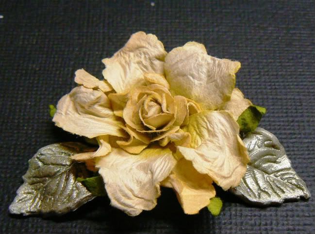


Supplies:
Polymer Clay
Leaf die cut
Leaf veiner
Perfect Pearls
Dusting brush


Step One: Gather all your supplies together. Break off a piece of polymer clay and work it between your palms until its soft enough to manipulate. Roll a thin layer out onto your non-stick craft mat.
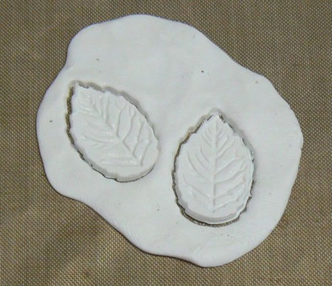

Step Two: Using a leaf die cutter, cut out as many leaves in the size and shapes you require for your project. Vein your leaves.

Note: I purchased my leaf cutter from my local baking supply store. This particular cutter also has a plunger which you use to vein your leaf. They are usually available in sets of 3 different sizes.


Step Three: Dust the clay leaves with some Ranger Perfect Pearls. I used some Green Patina on these.


Step Four: Pinch and bend your leaves to create a more life-like appearance. Place your clay leaves into a pre-heated oven at 230 degree Fahrenheit for 30 minutes. Once your leaves have cooled they are ready to be added to your project.

These will add a lovely classic touch to your scrapbooking and card making projects.

Sunday, February 13, 2011

~Little Miss Attitude~

This was the layout I did for the SNR January Colour Inspiration call. These calls are exclusive to the SNR staffers and can be great fun. We are given 3 inspiration pieces and 2 colour palettes to choose from. Once you've made your selection then you have to use these to create a layout or card.

This is the inspiration piece and colour palette I selected. I was not only drawn to the design of the inspiration piece but also to the elements in the piece. I knew I could use my ballerina bloom tutorial to represent the fluffy flower in the bottom left picture. I also had a beautiful Dusty Attic chandelier piece I could use to represent the light fitting in the inspiration piece. I combined the lace and the ruffles of the cake icing to make the ruffled lace at the bottom of the photo.
I decided to use the design of the inspiration piece as my bg design. I used white cardstock which I then inked with various combinations of distress inks. I used aged mahogany, scattered straw, worn lipstick, walnut stain. I placed the photo in the centre of the design to put my own spin on the inspiration piece design as I did not want to duplicate it exactly.

These calls can be great fun and I hope you check back next month for the February piece which is my all time favourite of the ones I've done so far.
If you're a SNR subscriber then check it out in the mag on the 17th when the Feb issue is published.  

~Rock Star~

This layout was done for the SNR monochromatic call. The colour was red obviously, but what makes the SNR monochromatic calls more of a challenge than any other monochromatic challenge I've ever come across is that we were only allowed to use various shades of red, NO NEUTRALS were allowed.
This made everything that much more difficult.

I decided to approached the challenge from a different angle. If I couldn't use colour to add interest to my layout then I'd use various textures instead.
I first painted my red cs with some red acrylic paint which I them sprinkled with some very fine glitter while it was still wet. Once that dried I added a piece of red corrugated board which I framed with red string beads. I used a piece of embossed metal sheeting to frame my photo. I coloured the metal with some raisin alcohol ink (the metal is much redder IRL). I also handcut some metal flowers which were also coloured with some raisin alcohol ink and layered with some painted Prima blooms and red pearls.
To finish off I coloured some rhinestone alphas with alcohol ink for my title lettering.

Even though this is not one of my favourite layouts I've ever done, I was excited to have met the criteria of the challenge and produced an interesting layout if nothing else.