Great news!!! Part 2 of the May edition of the SNR is now available. To say that this is filled to the brim with some amasing stuff would be the understatement of the year. Just look at what some of the readers had to say already.
"I went to the scrapping tutorials section and my jaw dropped. I couldn't believe how many there were and every one of them was excellent. I sat for 3 hours just soaking it up until my 3 yo asked me when I was going to get off the computer." - MaryBeth Connelly
"I couldn't choose a favorite if I tried but OMG, the second installment is incredible! I don't know how you guys keep topping yourselves but you always do. I plan to go put this on my blog. No scrapbooker should be without a subscription." Anne Frost
"Awesome. It's the only word for it. Well, I've got 3 more for you. Keep it up! LOL" Jeanette Kaplan-Gregory
Not only will you be treated to some great tutorials (some by yours truly..LOL), Kate our brilliant Editor-in-Chief has written a fantastically entertaining and educational article called the introduction of gels, mediums and paste which is an absolute must read. Not only does she have a great sense of humour but she single handedly takes the scary out of mixed media for those scrapbooking artist wanting to make the plunge but may still be too nervous and unsure. The best part is that this is only the beginning of the series. Personally, I can't wait for the next instalment.
Here's a quick list of what you'll find in Part 2
Scrapbooking Tutorials
Anglaise Pretties
Coloring Trim
Fabric Butterfly
Fabric Paper
Twisted Fabric Blooms
Adding a 3-D Effect to a Photo
Adding Text to Fabric
Coloring Black-and-White Photos with Chalk
Coloring Black-and-White Photos with Copic Markers
Curly Fabric
DIY Photo Overlays
Fibers Fabric Paper
Fabric Shapes
Ribbon Curling
Twisted Fabric Flowers
Using Dryer Sheets to Make Embellishments & Create Interest
Cards & Stamping Tutorials
Faux Stitching
Fork Bows
Heat Embossing on Fabric
Heat Embossing on Photos
How Do I Attach That? - Ribbon
Stamping on Velvet
Mixed Media Tutorials
An Introduction to Gels, Mediums & Pastes
Adding Cardboard to Your Project
Baby Wipe Background
Canvas Breakdown: A Home
Crinkled Cardstock Background
Gels, Mediums & Pastes Primer
Paper Towel Background
If you haven't subscribed yet, then best you sign up now because not only will you be treated to all of the above but you'll have access to all the other fantastic tutorials and primers from the last 3 months, not to mention all the great inspirational pieces in the scrapbooking, cards, digital and mixed media sections.
Tuesday, May 31, 2011
Tutorial - Embossing Resist Stamping
This ia a quick and simple stamping technique tutorial featured in the April issue of SNR
This is an easy technique that anyone can try with fabulous results regardless of your stamping experience. This technique can be used with background stamps or image stamps. It's also a great way to make your sentiments pop right off your cards or projects.
Here's what you need to get started

Supply list
Clear embossing powder
Clear embossing ink
Stamp
Distress ink
Blending tool
Heating tool
Craft mat
 Step one: Using clear embossing ink stamp your image onto your tag, ATC or LO.

Step two: Cover your stamped image with clear embossing powder, dust off excess powder and heat with your heating tool. For this exmple I used Rangers Super fine detail embossing powder.
 Step Three: Once your embossed image has cooled, using distress ink and your blending tool, ink the area over and around your stamped image. Once you start inking the paper the embossed image will pop. The clear embossing powder resists the ink so the colour of the paper underneath the embossed image will shine through.
For my tutorial I used the super fine detail embossing powder but for a more distressed looking stamped image you could use clear UTEE as I did in this example.

This is an easy technique that anyone can try with fabulous results regardless of your stamping experience. This technique can be used with background stamps or image stamps. It's also a great way to make your sentiments pop right off your cards or projects.

Here's what you need to get started

Supply list
Clear embossing powder
Clear embossing ink
Stamp
Distress ink
Blending tool
Heating tool
Craft mat


Step two: Cover your stamped image with clear embossing powder, dust off excess powder and heat with your heating tool. For this exmple I used Rangers Super fine detail embossing powder.

For my tutorial I used the super fine detail embossing powder but for a more distressed looking stamped image you could use clear UTEE as I did in this example.

Notice how much more distorted the image is. This is a very simple but visually effective technique that can be used to create gorgeous backgrouds for tags, ATC's, cards and even scrapbooking layouts. I've made several layout backgrounds using this technique on plain white cardstock with distressed inks with gorgeous results. You can also achieve the same gorgeous results using glimmer mists instead of the distress inks.
Monday, May 30, 2011
Tutorial - Non digi photo alteration
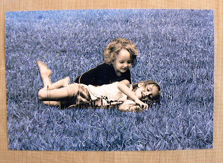
I'm a paper scrapper only but often admire all the great techniques digi scrappers use on their photos. Some of the techniques leave me drooling at the mouth wishing I had the IT know-how and software to do the same. However, I enjoy the feel of paper between my fingers and getting all messy with inks and paints too much to consider ever crossing over so instead I search the internet for unique non-digital techniques to add interest to my photos. That's when I came across this great technique introduced to me by my very dear friend Lisa Valentine which I'd like to share with you now.
Supplies
Black & white AND sepia copy of the same photo
Sharp scissors for fussy cutting
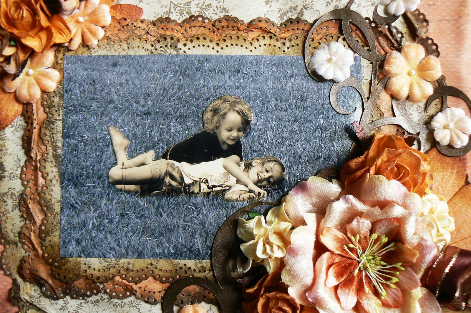
 Step One: Have the same photograph printed in black & white and sepia. Pictures that have a large background area with a definite focal point work best with this technique. The picture I selected is of my youngest two kids playing on the grass. You'll notice that the grass makes up the majority of the print with the kids being the obvious focal point.
 Step Two: Using your fussy cutting scissors or a regular pair of sharp scissors, cut the focal point image out of the sepia photograph.
Step Three: Align the copy of the sepia focal point image over the black & white image so that they match up exactly. Make sure that none of the B&W focal point image is visible behind the sepia image before pasting down with your choice of adhesive.
It's that simple. Now you have an interesting and eye catching photograph to use on your layouts or craft project..
This is what the photo looks like on my finished layout

Supplies
Black & white AND sepia copy of the same photo
Sharp scissors for fussy cutting


Step Three: Align the copy of the sepia focal point image over the black & white image so that they match up exactly. Make sure that none of the B&W focal point image is visible behind the sepia image before pasting down with your choice of adhesive.
It's that simple. Now you have an interesting and eye catching photograph to use on your layouts or craft project..
This is what the photo looks like on my finished layout

More details about this layout will be posted tomorrow.
Monday, May 23, 2011
~Say Cheese~


Keep a look out for the detailed tutorial coming soon.
Sunday, May 22, 2011
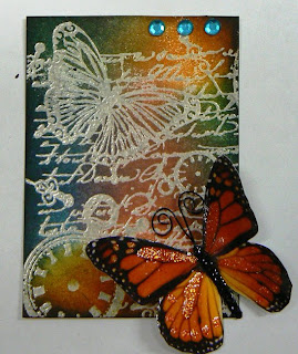
~Tough Guy~

I did this LO for the grunge call for the April issue of SNR. I used a combination of inks, metal and pastes to obtain the grunge look.

For the title I used some Ten Seconds Studio metal which I turned over onto the wrong side and wrote each word backwards using a defining tool. I also made a border using the same tool drawing squiggles. I then turned the piece right side over and sanded the raised edges.


TFL
Saturday, May 21, 2011
~Timeless Memories~ March Swirlydoos kit
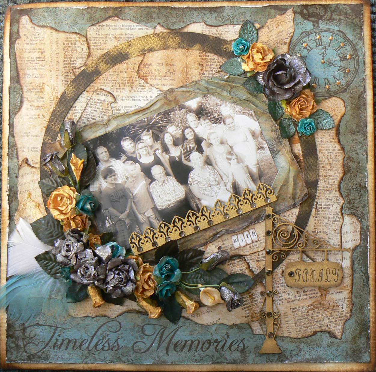
I know I mentioned it before but I really do LOVE this particular kit. Vintage is one of my favourite styles and these pp's and the embellies Krissy put together in the kit are all just perfect.
I created an aged look using some gel medium, ink, mist and paint for an upcoming tutorial. I can only post the tutorial later this month for publication reasons but if you love vintage then this is oe you wont want to miss.


Thank you for stopping by and be sure to stop by again for the detailed tutorial.
Friday, May 20, 2011
Tag - Dress Form

I made the necklace using some tiny gems I got at a local craft store. I finished the tag off by adding some string pearls which I coloured with some alcohol ink and stuck to the very edge of the tag border. The gorgeous vintage ribbon was a gift from my dear friend Andrea (Zuk) which added the perfect finishing touch to my tag.
Wednesday, May 18, 2011
~Sweet Memories~

I used the February Swirlydoos kit for this layout. This kit is one of my all time favourites to date. I absolutely love the vintage colours and embellies that Krissy put together. I used the fabulous sketch that came with the kit and am delighted with how it turned out. This was also featured in the April issue of SNR for the scrap your stash (Flowers) call.
I used a photo technique I learnt from my very ggod friend Lisa Valentine which I'll be posting a short tutorial for in the very near future. The tones of the TPC pp's complimented the picture perfectly. I matted the pic with some pp's that I used my Martha Stewart border punch on.

This gorgeous Prima bloom complimented the pp's perfectly and then I added some Hydrangeas that I got from iamroses.com which I misted with some of the tattered angels mist that came with the kit. The smaller peach Prima blooms have been in my stash forever so I was excited to see I could finally use them. I pasted a piece of cardstock over the mirror part of the frames that came in the kit and stamped my title using some JustRite stamps. The ribbon was also from my stash.

The large petaloo flower was also part of the kit. I misted it and inked the edges with some vintage photo distress ink.These are more of the iamroses blooms from my stash

Anyone who knows my work, knows I LOVE distressing so of course I had to throw in some water distressing here and there to finish it all off. I'll be posting some water distressing techniques in the very near future so if you wan to learn the technique then check back soon.
Thursday, May 5, 2011
Do you want a chance to be published??

Crafter from all skill levels are invited, so go ahead and submit.
Monday, May 2, 2011
When things DON'T go as planned
This is the first article I've ever written which was featured in the March edition of SNR. I was sooo nervous trying to think of an article topic when I had a bit of a mishap with a LO I was working on and the idea to write about the experience came to mind..........BTW, this is the unedited edition so it's probably not as good as the mag version...LOL!
This is something all crafters have encountered at some point. We conceive what we think are brilliant ideas and then when we attempt to reproduce those ideas in reality they fall short of our expectations and worse yet, look nothing like we originally planned.
This is what I was up against when I set out to work on a layout for the “white space” call. I am a self-confessed “busy layout” scrapper so it is always a challenge for me to leave white space on a layout. But I accepted the challenge and thought I had come up with a brilliant design to put it all together. Mixed Media is a relatively new concept to me and I have had aspiration to incorporate some paste mediums directly onto my scrapbooking projects since I first discovered them. I was hoping that this was going to be my opportunity. Little did I realise just how tricky these pastes can sometimes be to work with, especially to the very inexperienced. A quarter of the way into my project things started going horribly wrong, to the point that I had just about decided to throw what I had into the bin. I took a little break from the project and came back and realised I was faced with two options. I could either chuck out what I had done or re-think my original plan and see if there was any way I could salvage my project. Because I’m an extremely stubborn person by nature it is very hard for me to accept defeat so I altered my original design and persevered. I learnt a valuable lesson from this project and I’d like to share my experience with you.
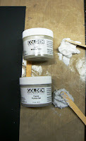
To better understand this project I will give you a brief outline of the original design I had in mind. I had already selected the picture I wanted to use of my youngest son bare-chested lying on a blanket which I had printed out in black and white. I was going to crop the picture down and then add some gorgeous Dusty Attic angel wings to the picture. I then wanted to frame the picture with a combination of textured molding paste and some coarse pumice paste directly onto the cardstock. The angel wings would be embedded into the pastes along with a few random embellishments like buttons, metal keys, etc. Once this dried I would paint it all with some Liquitex metallic ink paints. This would all be done on a small area in the bottom left leaving the rest of the cardstock empty, thus creating white space. Sounds easy hey……..? Not so, I discovered the hard way.
 I got off to a good start with my picture placement against the black cardstock which I knew would be a great contrast against the metallic paints I planned on using.

 (Insert image of me screaming and banging my head against the wall here). This was where things started going horribly wrong. After I embedded the angel wings and a few other random embellishments I added more paste and spread it a little more and then some more until I was left with what looks like a mud puddle gone wrong. This was definitely not the idea I had in mind.
At this point I was ready to trash the project because there was no way I could work with what I had. At least that is what I thought until I took a breather and then decided to salvage this project. I don’t have pictures for the next few steps because I wasn’t sure if I could make this work and was too focussed on what I was doing to stop and take pictures.
 I decided to remove the angel wings (easily done because the molding paste is slow drying) and cut a portion of the project out. I left a 1.5” frame around the picture with the paste on. I painted the angel wings with some gold and bronze Liquitex metallic ink paints and re-embedded them into the paste.
 I added some extra molding and paste and used my finger to create more prominent dips and peaks in the paste.
 I covered the bottom of the framed area with some more heavy coarse pumice and embedded a button and metal key into it. I put it one side to dry overnight.
 Once the paste was completely dry I painted it with a combination of gold, silver and bronze Liquitex ink paint. This is a stunning combination and I was delighted with the result. At this point I started feeling a lot more optimistic about my project again. Maybe I was going to be able to salvage this disaster after all.

Look at the stunning effect of the metallic paints on the coarse pumice.
 I realised the gold and bronze was very over-powering so decided to add some black tar gel to break it up a bit. I used some masking tape to cover my photo and the angel wings to protect them from the tar gel.
 On my non-stick craft mat I mixed equal portions of Golden tar gel and Golden soft gel medium together with some black Liquitex ink paint. The soft gel medium helps restore the body of the tar gel that the ink paint compromises.
 Using a trowel, I scooped up some of the coloured tar gel and slowly moved it back and forth over my frame. The tar gel has a stringy consistency so it will fall onto your project in thin threads. I put this one side to dry with the masking tape still in place.
 Once the tar gel had completely dried I removed the masking tape and was blown away by the result. In my original design I had not planned on using this technique, so things were definitely looking up.
 I painted the edges of a piece of black cardstock with the same combination of gold, silver and bronze I used on the paste to use as my layout base.
 With a second piece of black cardstock I used the water distressing technique to distress all four sides. I then painted the raised creases with some random strokes of gold paint. I then layered this on top of my base cardstock with the painted edges.
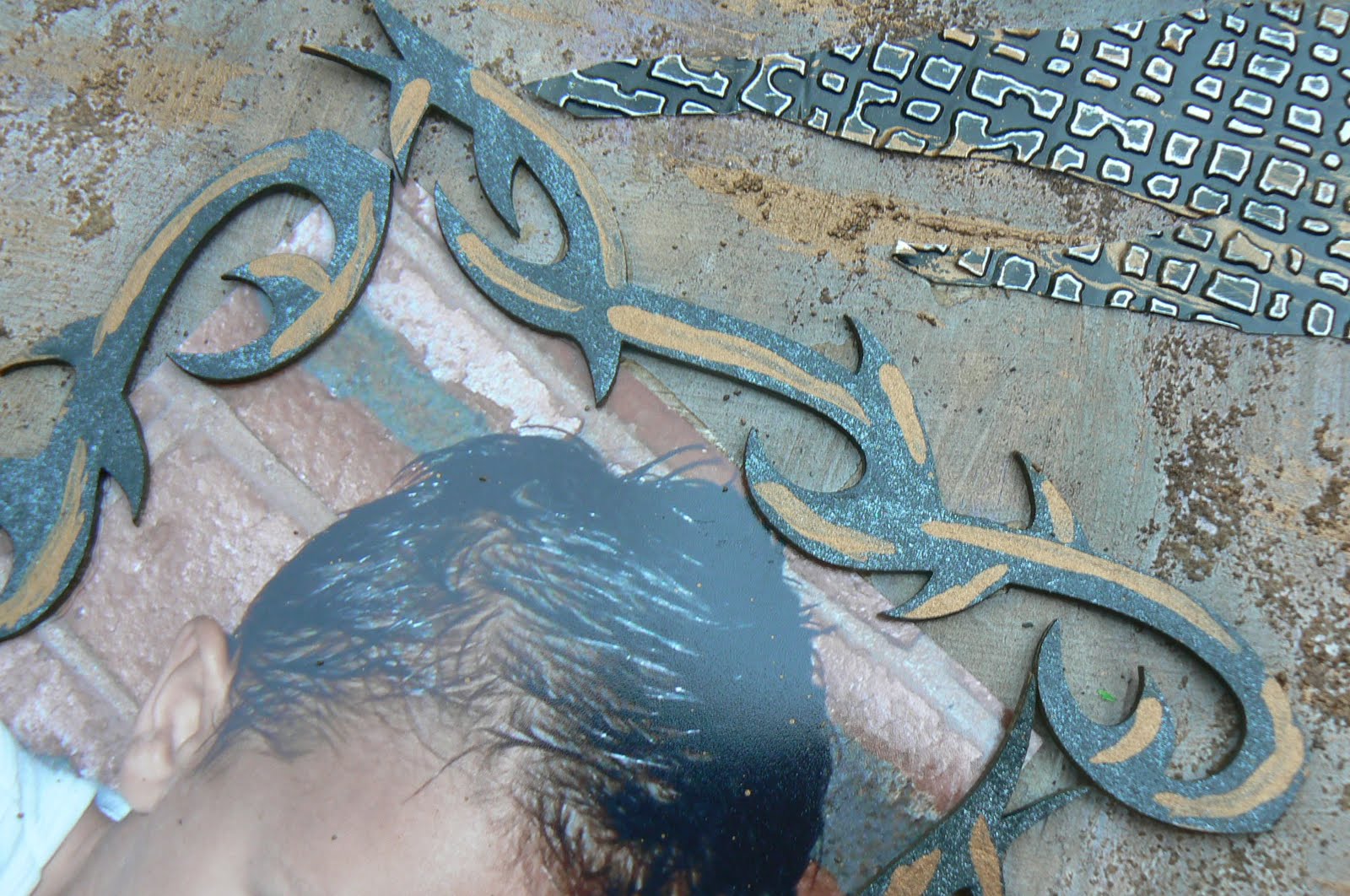
 I have to take a moment here to show you a close-up of the black tar gel on the gold paste. Don’t you just love the effect. This is definitely a technique I will use again in the future.
 I painted some white Prima flowers and added a vintage brad by Creative Charms. I used some copper and gold Ranger alcohol ink mixatives to alter this metal angel charm I had in my stash which I hung from some metal chain I bought at a discount craft store by the yard.
 Using my melting pot, I melted some bronze and platinum UTEE together and poured it into this metal plaque. Once it had dried I added some title stickers.
 I also painted a piece of cream lace I had with the metallic paints and added that to the top right of my layout with the bronze plaque underneath it.
 I had some large daisy bloom in my stash that were printed with these really gaudy patterns so I painted those with some metallic paints too, transforming them from gaudy to gorgeous. I used another Creative Charms brad as a flower centre.
 I stepped back and looked at what I had created. Even though it looked nothing like the original idea I had in mind, I was rather pleased with the result. This entire experience taught me that when things aren’t quite going as you planned, rather than give into your frustration and give up, dig deep and persevere. You may not end up with what you planned but you could learn a few new things along the way. I would never have thought to add the tar gel to my project until I was faced with this dilemma and now I’ve discovered a new technique I absolutely love.
I know that many of you will be able to relate to this experience and I hope that I have in some small way inspired you to dig a little deeper the next time you are faced with a situation like this. Don’t give up, just re-invent your original idea. You’ll never know unless you try.
This is something all crafters have encountered at some point. We conceive what we think are brilliant ideas and then when we attempt to reproduce those ideas in reality they fall short of our expectations and worse yet, look nothing like we originally planned.
This is what I was up against when I set out to work on a layout for the “white space” call. I am a self-confessed “busy layout” scrapper so it is always a challenge for me to leave white space on a layout. But I accepted the challenge and thought I had come up with a brilliant design to put it all together. Mixed Media is a relatively new concept to me and I have had aspiration to incorporate some paste mediums directly onto my scrapbooking projects since I first discovered them. I was hoping that this was going to be my opportunity. Little did I realise just how tricky these pastes can sometimes be to work with, especially to the very inexperienced. A quarter of the way into my project things started going horribly wrong, to the point that I had just about decided to throw what I had into the bin. I took a little break from the project and came back and realised I was faced with two options. I could either chuck out what I had done or re-think my original plan and see if there was any way I could salvage my project. Because I’m an extremely stubborn person by nature it is very hard for me to accept defeat so I altered my original design and persevered. I learnt a valuable lesson from this project and I’d like to share my experience with you.
To better understand this project I will give you a brief outline of the original design I had in mind. I had already selected the picture I wanted to use of my youngest son bare-chested lying on a blanket which I had printed out in black and white. I was going to crop the picture down and then add some gorgeous Dusty Attic angel wings to the picture. I then wanted to frame the picture with a combination of textured molding paste and some coarse pumice paste directly onto the cardstock. The angel wings would be embedded into the pastes along with a few random embellishments like buttons, metal keys, etc. Once this dried I would paint it all with some Liquitex metallic ink paints. This would all be done on a small area in the bottom left leaving the rest of the cardstock empty, thus creating white space. Sounds easy hey……..? Not so, I discovered the hard way.

I prepared myself for applying the pastes by placing a tablespoon full of both the Golden light molding paste and the heavy coarse pumice paste onto my non-stick craft mat.

Using a trowel, I applied some of the light molding paste around the two sides and top of the photo and some heavy coarse pumice paste around the bottom of the photo. I then used my finger to spread the molding paste creating dips and peaks as I went.

At this point I was ready to trash the project because there was no way I could work with what I had. At least that is what I thought until I took a breather and then decided to salvage this project. I don’t have pictures for the next few steps because I wasn’t sure if I could make this work and was too focussed on what I was doing to stop and take pictures.


Look at the stunning effect of the metallic paints on the coarse pumice.


I know that many of you will be able to relate to this experience and I hope that I have in some small way inspired you to dig a little deeper the next time you are faced with a situation like this. Don’t give up, just re-invent your original idea. You’ll never know unless you try.
Subscribe to:
Posts (Atom)